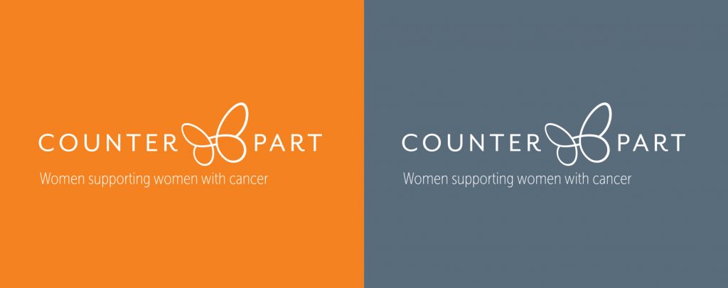
Women’s Health Victoria recently launched Counterpart, the new name and visual brand for their cancer support service, formerly known as BreaCan.
Counterpart connects, supports and informs women with breast or a gynaecological cancer to live well.
The new name and tagline ‘Counterpart – Women supporting women with cancer’ was developed by Fenton to better represent the comprehensive, holistic service they provide for women living with breast and gynaecological cancer.
In developing the brand, Fenton workshopped with staff and peer support volunteers to set a direction that would resonate with different stakeholders – particularly women.
The name Counterpart makes no mention of cancer. Instead it puts peer support, an integral part of the service, at the heart of the new brand and celebrates the trust, warmth, care and positive energy created when women connect and support each other.
The tagline provides a clear description of the service highlighting shared understanding, empathy and partnership.
In developing an icon for the visual brand we wanted to avoid cliché and create a design that expressed support and connection as well as professionalism.

The icon represents two elements working as a whole; it references wings working together to achieve flight and could also suggest two people embracing. The single continuous line references the infinity symbol and represents a journey or path.

The typeface chosen has a playful letter ‘R’ adding personality to the other timeless uppercase letters. The orange used is part of the Women’s Health Victoria brand and is a subtle way of linking the two brands.
Feedback following the brand launch was very positive and we wish Counterpart and Women’s Health Victoria all the best.
by Aaron Williams