When I started at Fenton in 2008 one of my first projects was to develop a new brand and annual report for the Accounting Professional & Ethical Standards Board (APESB). The APESB is an independent organisation that sets the code of ethics and professional standards in the accounting profession.
The first report was a PDF-only design using their existing brand. The following year we recommended a limited digital print run report to launch the new brand. Digital printing is a cost-effective and surprisingly high-quality option for organisations that only need a small number of hardcopy reports.
The brand we developed features a white square framed by overlapping angled blue and yellow squares of the same size; a subtle play on dimension and negative space that creates a strong visual statement using modest means.
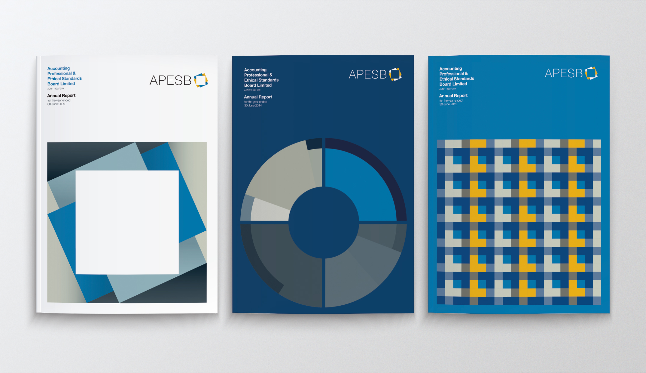
These elements formed the basis of the first APESB annual report cover I designed to introduce and celebrate the new look. Placing the brand in a square with additional shading reinforced the use of dimension and negative space. This graphic minimalism was chosen to reflect the organisation’s professionalism and create an understated timeless quality.
For the following year’s design, the client and Fenton decided to retain the look and feel of the previous year and introduce a new feature graphic as a way to continue the theme and build a consistent series of reports. (Inside page templates and styles were also retained over multiple years with intermittent subtle style revisions.)
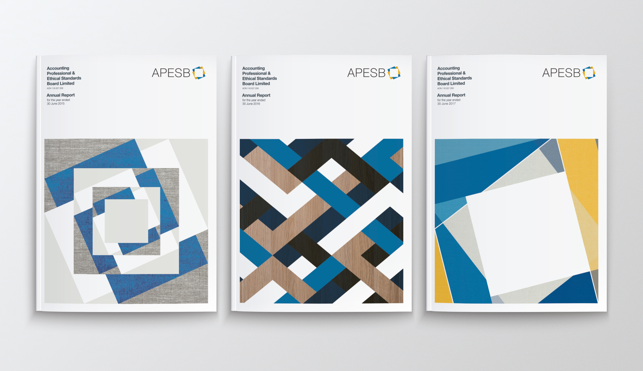
Each year when the project comes around there’s excitement and a little trepidation about what we can do for the next cover. The challenge is developing a fresh solution with the same elements. Over nine years we used these elements to create abstract compositions that were allowed to evolve every year through new combinations of pattern, texture, shape and colour.
Each time the project starts, favourite design solutions from previous years appear on the screen first but it doesn’t take long for some new combination to emerge and open doors to all sorts of possibilities.
What I’m most proud of as a designer is that the APESB brand has remained contemporary over the years and that our client trusts us to create something new but familiar for one of their most important publications.
The 2017 APESB Annual Report is now hot off the press and we look forward to many more years working together.
By Aaron Williams