In our visual designs for a new suite of Yarra Ranges Council community publications we used the expressive energy of the brave brushstroke to help engage residents and council stakeholders.
Yarra Ranges Council produce a plan every four years at the beginning of the electoral term, with an Annual Report, Mid Year Report and Action Plan produced annually. Fenton were asked to streamline production and create a common design solution for all documents. The creative concept for the documents would stay the same over the four-year period, using fresh colour and text to distinguish each year.
The brief was to move away from corporate imagery and create a progressive, engaging and contemporary design.
In developing design options we considered three approaches: the first used icons to represent the five objectives underpinning the Council’s new strategic framework; the second approach used typography to create bold, poster-like covers based on community values. But it was our third option – a series of loosely painted local streetscapes featuring a range of different community members – that excited us most.
This concept was embraced by the Council so I donned my artist’s hat and got to work creating the imagery. I tested real and digital brush strokes and chose the later because it allowed me to alter illustrations more easily during development. The background colour washes are hand painted in black and then enhanced with colour using online graphic editing tools.
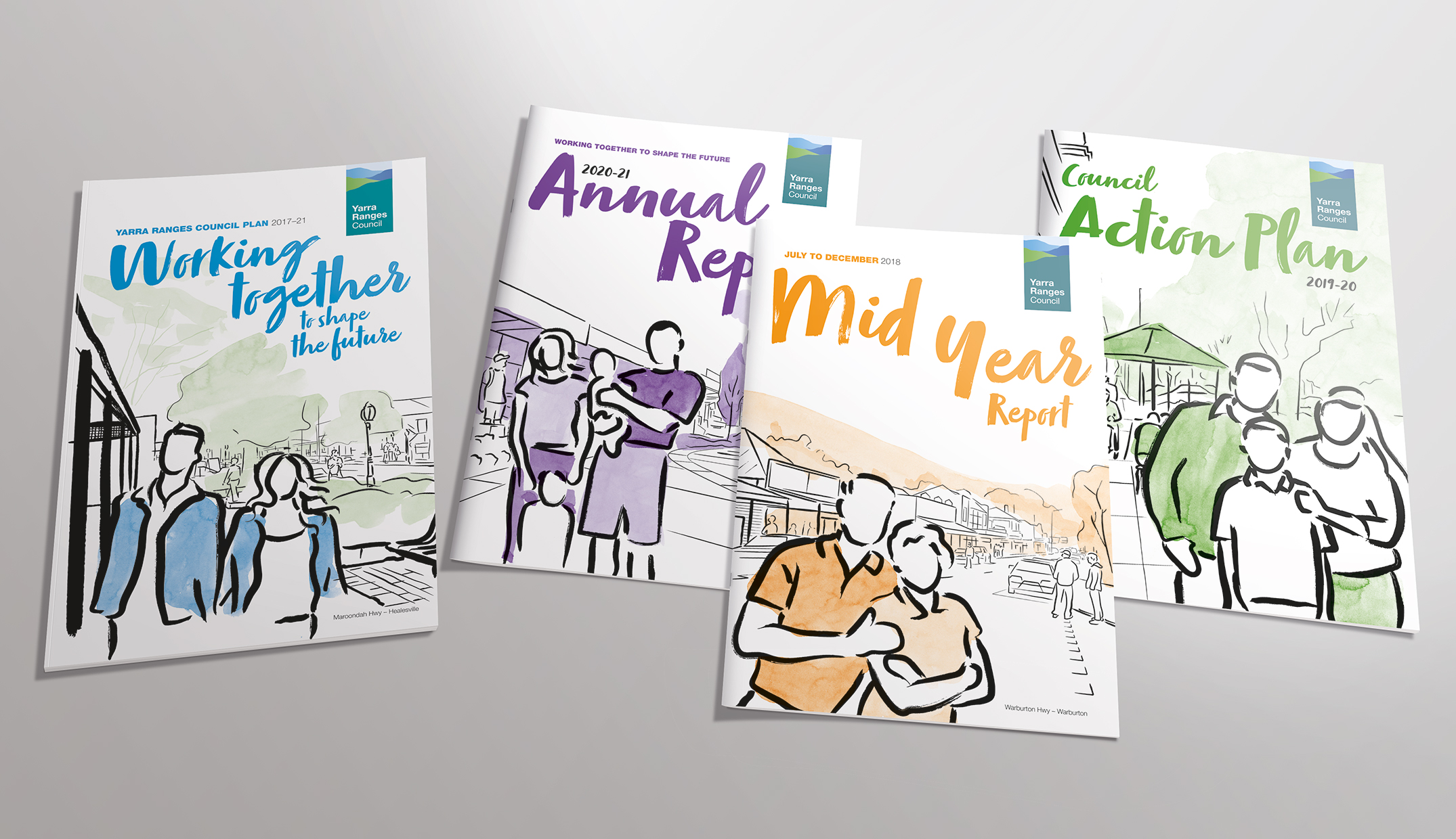
With a loose brush style the knack is deciding what to keep and what to leave out. We needed the streets to have enough architectural features to accurately represent locations while leaving out many mid-ground and background details to create a more artistic impression. Background washes were part of the colour coding system but also helped anchor lines to surfaces, emphasising depth and mass.
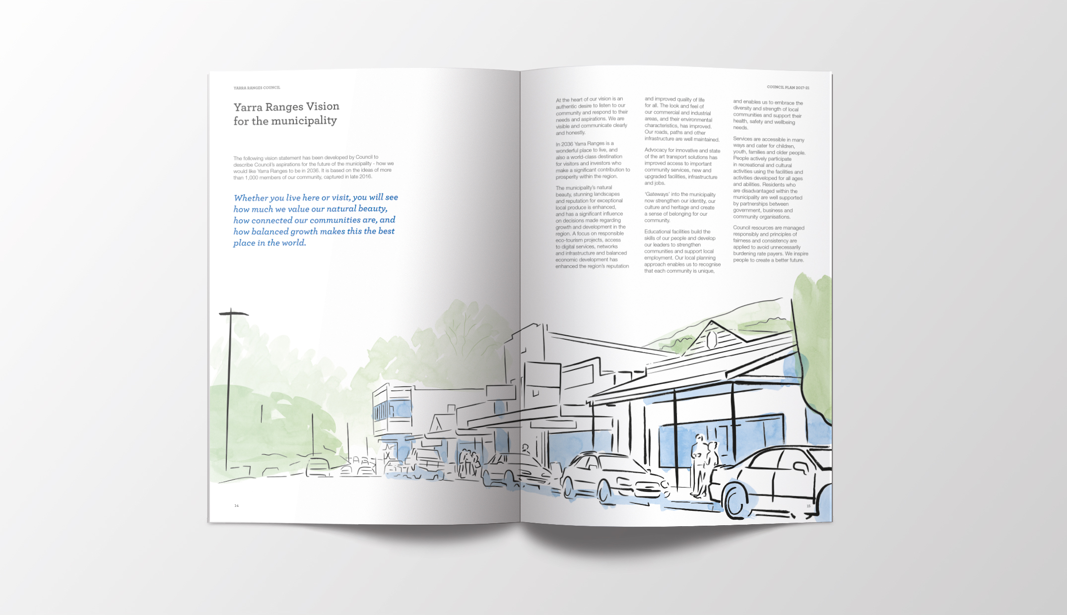
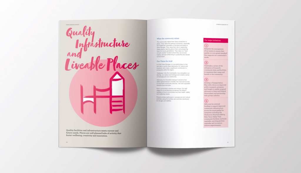
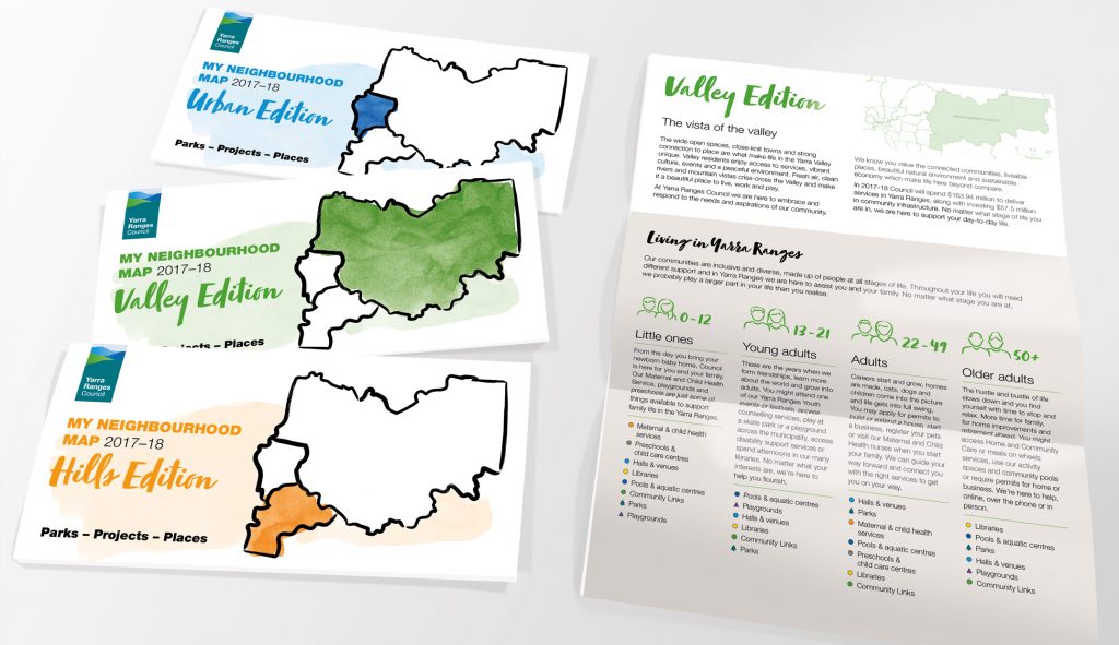
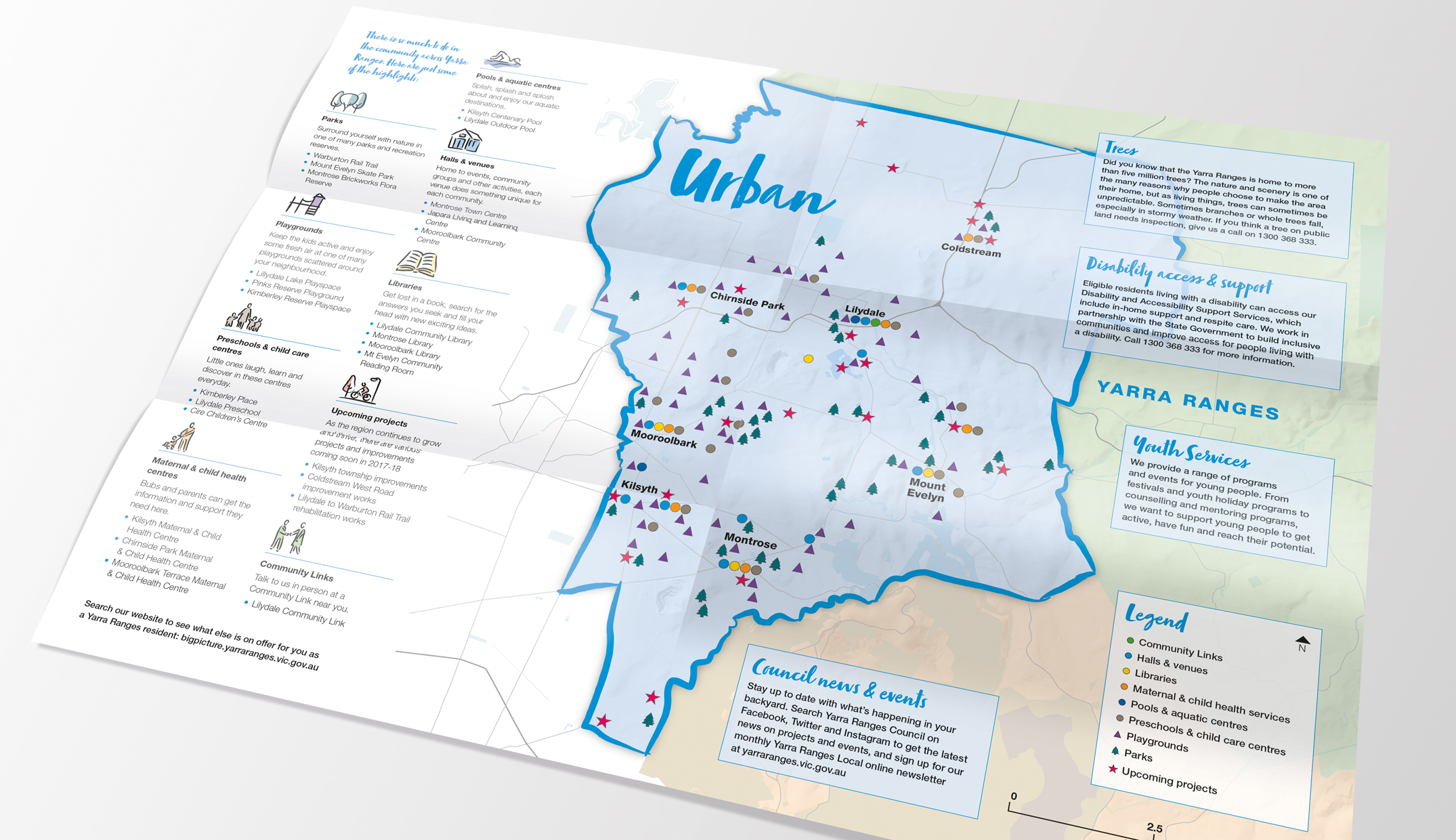
I applied brushstroke typography to headline text to compliment the illustrations and contrast with the necessarily structured design of the internal document pages. Additional streetscapes, maps and strategic objective icons were created in the same style and used throughout the material.
Creating the concept and applying it across the suite of documents was fun and challenging. As a designer, I moved beyond my day-to-day comfort zone and experimented with different design techniques until I found the right balance between abstraction and recognition. Plus, getting down (and dirty) with ink and paint brushes took me right back to my pre-digital days!
By Aaron Williams